Brand identity · Logo & icon · UX Design
KIKA
Rebranding for a dog training & daycare company

·
Redesign the brand with a new logo, icons, and website that convey reliability and professionalism to dog owners aged 30-40.
·
Produce a photo shoot that captures the brand’s emotional impact and showcases the company’s training services.
Brand Analysis
Where the Brand Stands Today
·
Analyzed the existing website’s UX design and brand identity to identify what needed improvement
·
Researched the brand’s target audience to understand their needs, habits, and expectations

UX Design Analysis

Elena, 35, IT Consultant
Core Needs
Expert-level dog training guidance, flexible daycare availability, and precise, trustworthy information on the website
Motivation
Wants enough information upfront to feel educated and confident before committing, which sparks her motivation to train her dog properly
Challenges
Capturing her interest quickly and keeping content consistently up-to-date to maintain trust.
Misaligned Brand Identity
The playful design didn’t communicate the brand’s core values and professionalism
Weak Visual Representation
The brand lacked strong photography that authentically represented its services and identity
Inconsistent Design
Fonts, icons, and visual styles varied across the site, undermining a cohesive brand experience
Information Overload
Pages were overcrowded, making it hard to find and process key information clearly
Research Question
Design Process
Logo Design
The goal of the first phase was to explore different logo directions for Kika, experimenting with dog silhouettes, paw shapes, and heart motifs paired with typography

Design Process

First Proposal
Bolder & Minimalistic
The owner preferred a bolder, more minimalistic style over the original circular badge design
Elevating the Brand
Feedback pushed the brand toward a more upscale, luxury feel rather than a playful one
Project Development
Brand Identity
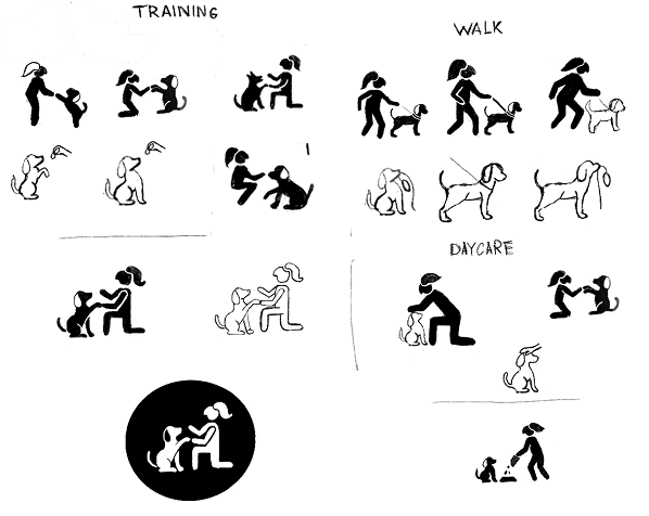
To address the owner’s feedback, the next phase focused on developing a bold, minimalist brand identity, including a logo pairing strong typography with a paw-and-heart mark, and a set of clean, single-line icons representing each service

Brand · Colors & Typography

Design Process
Logo (New)
Design Process
Icons (New)
Built on Research
Brand colors and palette were chosen based on research to convey trust and reliability
New Logo
The logo shifted from a circular badge to a minimalist, bold mark, with the paw-and-heart becoming the brand’s core illustration
Consistent Style
Service icons on the website were designed to match the logo’s style, creating one cohesive visual system
Project’s Evolution
Bring the Identity to Life
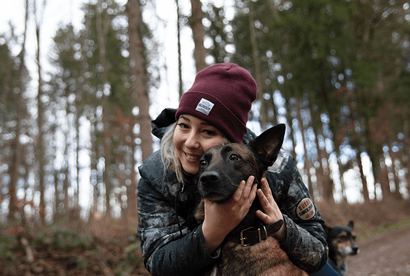
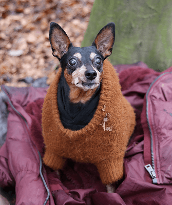
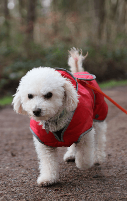
The final phase focused on building a new website around the updated brand identity, complemented by a photoshoot that captured the owner’s professionalism and personality in the new visual style



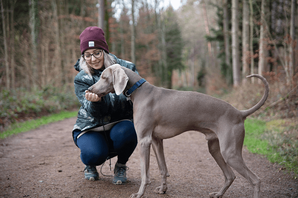
Photosoot results
Services (New)
Cohesive Design
The new site brings consistent typography, icons, and layout together, replacing scattered styles with one clear, professional brand experience
Tell the Story
New photography captures the brand’s warmth and professionalism, showing real training moments that build trust with dog owners
Outcome
Reintroducing KIKA

Website Design (New)
Evaluation of Results
Eye-tracking analysis confirmed the redesign works: following the natural “Z” reading pattern, key information now sits exactly where users focus first, proving the new layout outperforms the old

Old Website
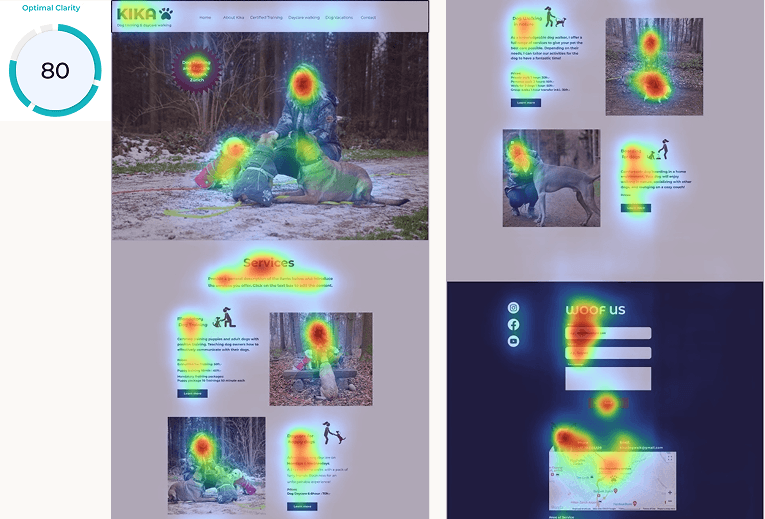
New Website
·
Working closely with the client at every stage ensured we stayed aligned and the final result truly matched their vision.
·
Balancing the client’s requests with proactive suggestions, like the additional photoshoot, created a stronger, more impactful result.